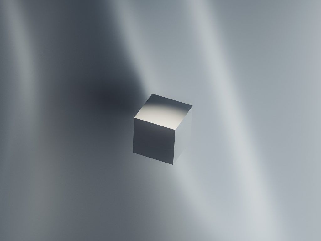
Thinking of applying shadow effects to your webpage? Or wondering how to make images look more appealing? Here comes CSS box-shadow -a simple CSS property with a surprising amount of potential!
In this web development article, we will explore the CSS box-shadow property. We will also see some cool CSS tricks with a box-shadow property that you might not know about. Additionally, you can also check Krishan’s Portfolio website to see where you can apply shadow effects. So let’s dive in! So let’s first understand what is a box-shadow property.
What is CSS box-shadow?
The CSS box-shadow property adds shadow effects to any HTML element on a webpage. It is often used to give depth and dimension to the elements to make your webpage look more professional. Additionally, it also controls the position, size, and blur of the shadow.
Now that you know what box-shadow is, let’s see how to use it in practice.

Syntax for CSS box-shadow
The syntax for the box-shadow property is as follows:
.element{
box-shadow: x-offset y-offset blur-radius spread-radius color inset | none
}
where,
x-offset: determines how far to place the shadow from the left border of an element. A positive value moves the shadow to the right, negative value to the left.
y-offset: determines how far to place the shadow from the top border of an element. A positive value moves the shadow down, negative value to the up.
blur-radius: determines how blurred is the shadow. A higher value means more blurriness. Web developers can even set it to “0” to have a sharp shadow
spread radius: determines how wide the shadow will be. Web developers can choose to have a shadow with a round or elliptical shape by setting this value to “0” or “50%”.
color: sets the color of the shadow
inset | none: Use inset to apply shadow inside the element. Use none if you don’t want to apply the shadow effect. Now we know about the different values to use in the box-shadow property. Let’s see some quick practical examples.
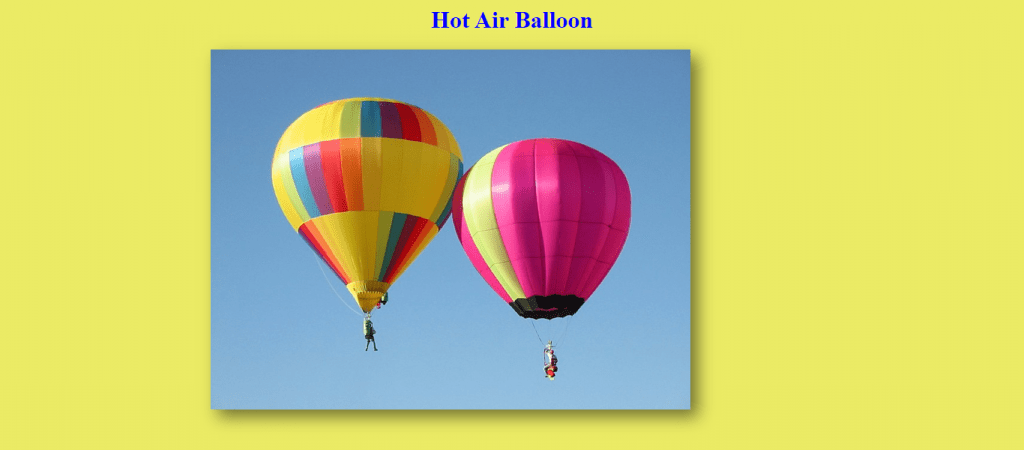
Shadow effect to an image
In this example, we will add a shadow to an image.
To do this, HTML and CSS code will be as follows:
<img src="HotAirBalloon.jpg" class="myimg">

.myimg{ height:80vh;margin-left:20vw;}
Here is how my webpage is looking –

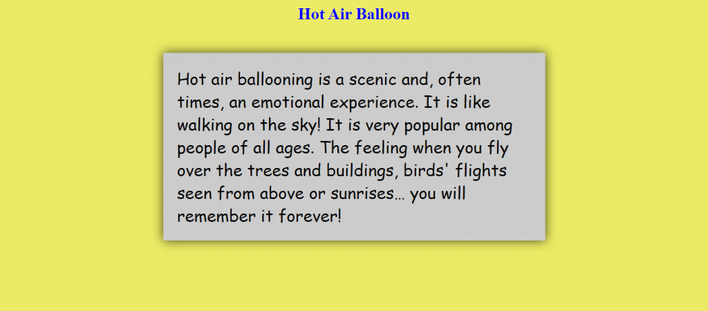
Now add the following CSS code for styling the image using the box shadow property:
box-shadow: 10px 10px 20px rgba(0,0,0,.5);So your whole CSS code should be as follows-
.myimg{ height:80vh;margin-left:20vw;box-shadow: 10px 10px 20px rgba(0,0,0,.5); }As you can see, we have added a shadow with x-offset of 10px, y-offset of 10px, blur-radius of 20px and, color of black. Here is how the webpage should look with shadow effect on the image-
You can play with the different values given above and see what shadow affects you can create!

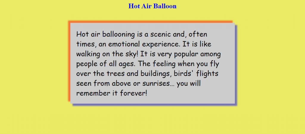
Drop shadow to an element
In this example, we will add a drop shadow to a div element.
To do this, HTML code will be as follows:
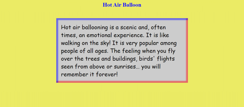
<div class="mydiv">Hot air ballooning is a scenic and, often times, an emotional experience. It is like walking on the sky! It is very popular among people of all ages. The feeling when you fly over the trees and buildings, birds' flights seen from above or sunrises… you will remember it forever! </div>Now CSS code for styling the text using the box shadow property:
.mydiv{
        margin:auto;
        padding:2%;
        width:50vw;
        background:#ccc;
        font-family:cursive;
        font-size:xx-large;
        box-shadow: 0px 0px 20px rgba(0,0,0,0.7);
        }
As you can see, we have added a shadow with x-offset of 0px, y-offset of 0px, blur-radius of 20px and, the color of black.
Also, we avoid using a solid color for the shadow effect. Adding opacity gives it a more natural feel as a 3D effect.
Time to see our webpage!
Multiple shadows
Let’s now see how to add multiple shadows to any element.
Change the value of the box shadow property as follows-
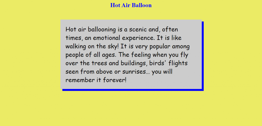
box-shadow: 10px 10px 5px rgba(0, 0, 255, 0.5),
           -10px -10px 5px rgba(255, 0, 0, 0.5);
As you can see, we have added two shadows. One shadow with the values x-offset of 10px, y-offset of 10px, blur-radius of 5px and color of blue. Another shadow with the values x-offset of -10px, y-offset of -10px, blur-radius of 5px and color of red. Here is how the webpage looks with multiple shadows-
Doesn’t it look more professional now? We can play with the values for the CSS box-shadow property to get different shadow effects. Shadows can make your webpage look more elegant and polished. So let’s see a few more examples.
Inner shadow using optional inset value
In this example, we will add an inner shadow to an element.
Add the optional “inset” value in the box shadow property as follows-
box-shadow: 10px 10px 5px rgba(0, 0, 255, 0.5) inset,
           -10px -10px 5px rgba(255, 0, 0, 0.5) inset;
Let’s see how the webpage looks with inner shadow-
So we added an inner shadow with the values x-offset of 10px, y-offset of 10px, blur-radius of 5px and, the color of blue.
And other inner shadow with the values x-offset of -10px, y-offset of -10px, blur-radius of 5px and, the color of red.
Solid shadow-
Skip the blur radius and spread radius values to get a solid color shadow effect.
Change the CSS code for the box-shadow property as follows to see how solid shadow looks like-
box-shadow: 10px 10px blue;Here is how your webpage should now look like-
As you can see we have applied shadow of solid blue color with x-offset of 10px and y-offset of 10px.
CSS box-shadow web development tricks!
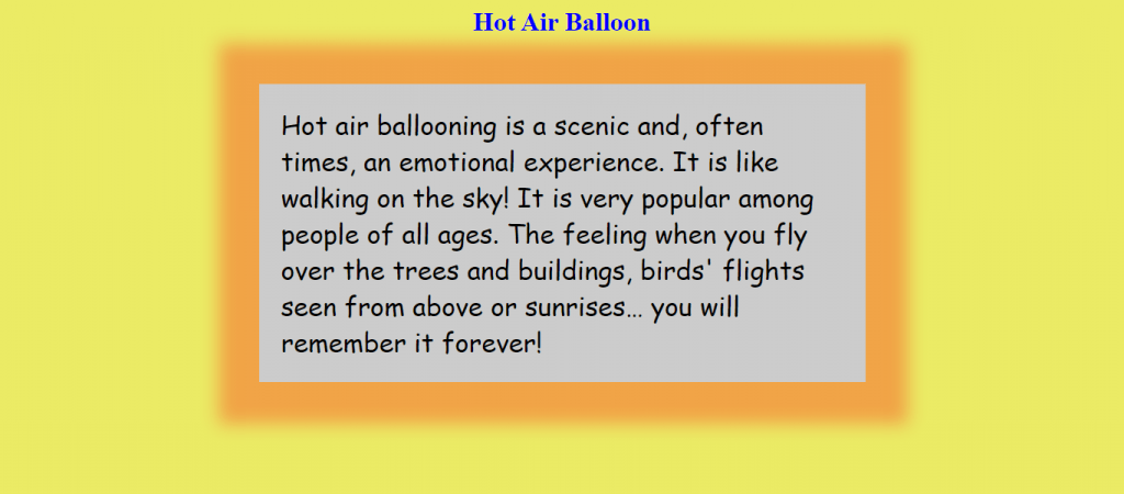
There are times when web developers might want to create a shadow that looks like a blurred frame. We can use the box-shadow property to achieve this effect.
Change your CSS code for the box shadow property as follows-
box-shadow: 1px 1px 20px 50px rgba(255, 0, 0, 0.3);So we added a shadow with x-offset and y-offset of 1px each, blur-radius of 20px, spread-radius 50px. And we gave a color of red with opacity of 0.3.
By setting the spread radius to 50px we increase the size of the shadow.
Here is how the webpage looks like-
Do you want to help your child become a better presenter or are you seeking coding classes for kids? Each lesson in the SkoolOfCode curriculum concludes with a crucial Presentation Day, which aids in your child’s overall development. So, why wait and Book a FREE trial class today.
Wrapping up! The CSS box-shadow property is a lot of fun! We can achieve different shadow effects by playing around with CSS box-shadow property. So go ahead and experiment! You never know what you might create!