Thinking of making your webpage even more attractive and fun to look at? Or wondering how to offer a great user experience and captivate your visitors? Here are some cool hover effects with hover pseudo class selector in CSS. You can use these effects to enhance the look & feel of your webpage. These effects will make your webpage more exciting and engaging.
You can also refer to Aaryav’s Portfolio Website to see hover effects in action. Aaryav is a student at Skoolofcode. He applied some cool hover effects on the Hobbies webpage of his Portfolio website. And his website looks amazing with these hover effects. In order to build future-ready creators, we at SkoolOfCode believe in a holistic STEM-based coding classes for kids that is personalized to fit the needs of each student. So, why wait and Book a FREE trial class today
So, before we see how to create these hover effects with CSS, let’s see the idea about it.
What is a hover effect?
Hover effects are subtle animations. These effects show when a user moves their mouse cursor over an element. Hover effects add life and beauty to the website. They can be anything as simple as color changes or image transformations. Or more complicated things like content sliders, animation, etc.

What is a Pseudo class Selector?
Pseudo-class selectors add presentational information to your HTML document. They specify the behavior or state of an element. They are instructions to tell the browser – what to do when certain events occur on certain elements. CSS defines different types of pseudo-classes like hover, link, visited, active, etc.
In this article, we will see how to achieve hover effects on different HTML elements with a hover pseudo-class selector.
Hover Effect on paragraph
HTML code for paragraph-
CSS Code-
#mypara{
margin-top:40vh;
width:10vw;
height:7vh;
font-size:40px;
overflow: hidden;
transition: 5s;
}
#mypara:hover{
width:99vw;
outline: black solid 2px;
}
Here is what the effect looks like-
You can see in the above code – that when we hover over the paragraph the text will start showing up. The paragraph will occupy the complete viewport (99vw). Also, there will be an outline of black color around the text. The transition of 5s specifies the duration of the hover animation. And on hover out it goes back to its original state (10vw width).
Glow Effect on a button on hover
In this example, we will have a glow effect on a button on the mouse hover.
Button code will be as follows:
<button class="mybtn"> Click Here </button>CSS code for hover state:
.mybtn{
width:80px;
height:40px;
margin-top: 45vh;
margin-left: 45vw;
transition:0.2s;
}

.mybtn:hover{
background-color:black;
border-color:orange;
box-shadow:0px 5px 50px -4px orange;
transform:translateY(-5px);
color:white;
cursor:pointer;
}
Here on the mouse hover on a button, the background color of the button changes to black with an orange border. The text color of a button is set as white and a pointer shows up. The translateY value is set to (-5px) so the button will move up by 5px on hover.
Here is what the effect looks like-

Animation Effect on an image on hover
By using different values of transform property, we can add an animation effect too.
HTML code :
<img class="myimg" src="HotAirBalloon.jpg">CSS code for hover state:
.myimg{
width:50vw;
height:auto;
margin-left:20vw;
margin-top:10vh;
transition:0.5s;
}

.myimg:hover{
border-radius: 50%;
box-shadow:10px 20px 10px 5px rgb(82, 81, 77);
transform:translate(40px,-40px);
}

This looks amazing!
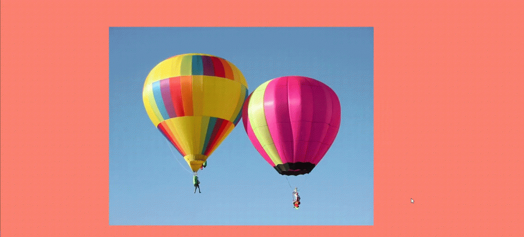
As you can see in the above CSS code – On hovering on an image there is a shadow effect. The border-radius sets to 50%. And we also add transform property, both translateY(-40px) and translateX(40px). The transition of 0.5s is set to the image to make the effect smoother.
Hover effect on the navbar
CSS code-
topnav a{
margin:1%;
text-decoration: none;
font-size:1.2vw;
border-radius:30%;
padding:1%;
color:black;
font-family: cursive;
transition: 0.5s;
}

#topnav a:hover{
background-color: cadetblue;
color:white;
border:1px solid black;
transform:scale(1.1); }
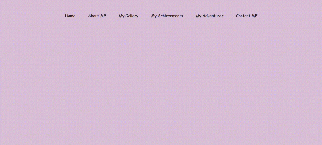
Here, when the user hovers over any link on the navbar, the background color, and color of the link change. The scale property increases the size of the element on hover by 1.1%.
Here is what the effect looks like-
Hover effect on div
CSS Code-
.col{
margin-top: 7vh;
margin-left: 5vw;
width:40vw;
display:inline-block;
}

.card h5{
font-size: 16px;
}

.card{
font-family: sans-serif;
width:15vw;
margin:2%;
padding:1%;
border:1px solid black;
background-color: rgba(248, 101, 101, 0.253);
border-radius: 10%;
display: inline-block;
transition:0.5s;
}

.col:hover .card:not(:hover){
filter:blur(1px);
}

.card:hover{
transform: translateY(-20px);
cursor:pointer;
}
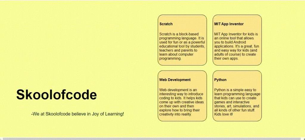
Here, we have 2 hover effects on 1 div. First is the blur effect on hover which blurs siblings on hover. The second one is a translation of the selected element upwards by 20px on mouse hover.
Here is what this effect looks like-
These are not enough!
There are many more hover effects that you can try with your elements. Now that you have a decent knowledge of hover effects, you can play around with different properties. Explore and create your stunning hover effects.
Cheers and happy coding! 🙂